 A Letter Worth Reading
Write · 3 min read
Structuring an issue
A good issue has a shape readers learn to trust. Here is a simple one you can use every time, from the opening lines to the footer.
Readers come back to letters that feel familiar, and shape is a big part of that.
The short version
- Use the same shape in every issue. Readers learn where things are.
- Open warmly, then give one main piece.
- Add a few short items, and ask readers to do just one thing.
- End with a footer that says who you are and how to leave.
Why a fixed shape helps
Think of a good weekend paper. You know where the puzzles are. You know where the letters page is. You don't have to hunt.
A newsletter can work the same way. When each issue has the same shape, readers relax. They know where to look, so they read more.
A fixed shape helps you too. You are not starting from a blank page. You are filling in parts you already know.
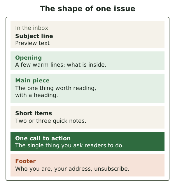
Here is the shape we suggest. Each part is explained below.
The opening
Start with two or three warm lines. Say what is in this issue and why it matters now.
For example: "Spring is late this year, so this month is all about frost. Plus, our new opening hours."
Keep it short. The opening is a doorway, not a room. Its job is to lead people to the main piece.
The main piece
Most newsletters have one main topic.[1] We think each issue should too. One clear idea is easier to read than five half ideas.
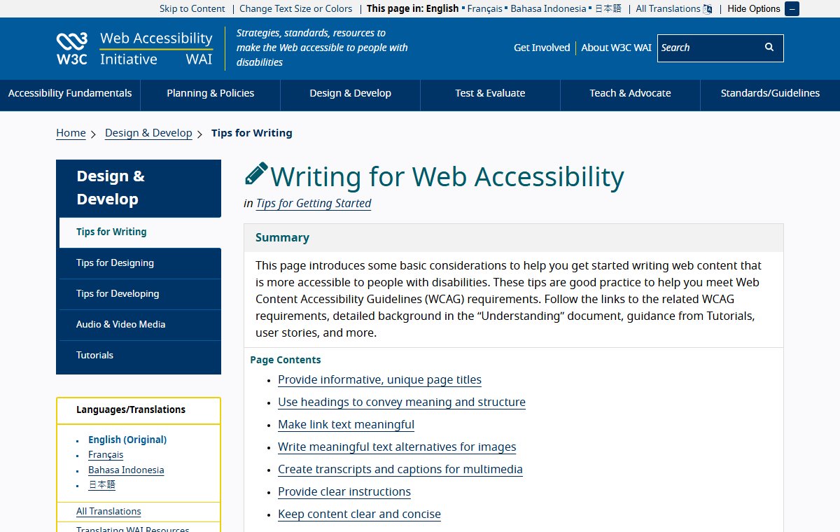
Give the main piece a clear heading. The W3C, which writes web standards, suggests short headings that describe each section.[2] Headings matter for anything longer than three or four paragraphs.[2]
Write in short sentences and short paragraphs.[2] Use a list when you have steps or a few items.[2] Your reader may be on a phone, on a bus, between other things. Make it easy.
Short items
After the main piece, add two or three short notes. Each should be a few lines at most.
Good short items include:
- A change to your hours or prices.
- A reply to a reader's question.
- A useful link, with one line on why it is worth a look.
If a short item keeps growing, it may want to be next month's main piece. Move it to your ideas list.
One call to action
A call to action is the one thing you ask readers to do. It might be "Book a seat", "Reply and tell us" or "See the new range".
Ask for one thing per issue. Three requests compete with each other, and readers often do none of them. One clear request is easy to say yes to.
Put it after the main piece, where readers have a reason to act.
Links that say where they go
Link words should tell readers where the link leads. The W3C advises against vague words like "click here" or "read more".[2] Google says readers should know what to expect when they click.[3]
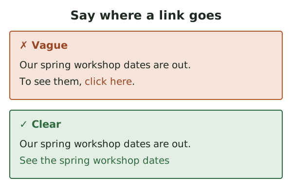
Clear link words help everyone. They help people who use screen readers, which read a page aloud. They also help someone skimming on a phone.
Images need words too
Images don't always show. A reader may have them turned off, or may not be able to see them. So never put key facts only in a picture.
Give each image alt text: a short description that stands in for the image. The W3C says it should give the information the image carries.[2] For a photo of new pots, "Three new glazed pots in blue, green and white" beats "image1".
Don't hide text with design tricks either. Google warns that hidden content can get mail marked as spam.[3]
The footer
The footer is the quiet end of every issue. It is also where the law expects a few things. In the US, that includes a valid postal address and a clear way to opt out.[4]
We cover the footer in detail in Unsubscribes and the law.
What to do next
Copy the shape into a template you can reuse. Write the next issue into it, part by part. Then work on the first thing readers see: subject lines and preview text.
Sources
- Writing for Web Accessibility, W3C Web Accessibility Initiative (accessed 2026-10-18)
- Email sender guidelines, Google (Gmail Help) (accessed 2026-10-18)
- CAN-SPAM Act: A Compliance Guide for Business, US Federal Trade Commission (accessed 2026-10-18)